Project Overview
The Yale School of Art website, while distinctive, suffered from several critical UX issues including poor visual hierarchy, lack of brand identity, and accessibility concerns. As a prestigious art institution, its digital presence needed to reflect its reputation while being functional and accessible to all users.
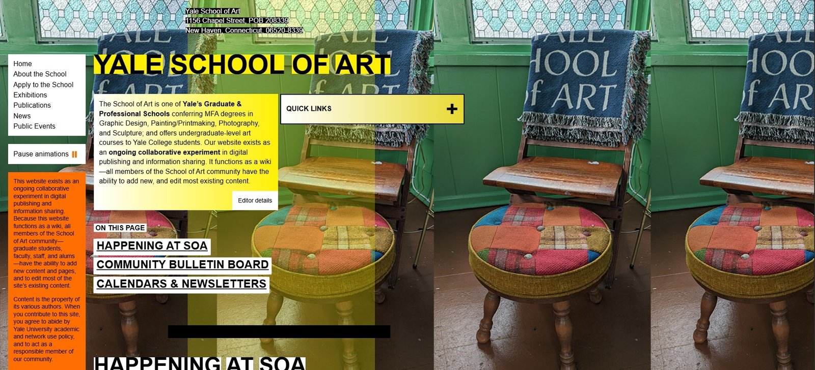
Original Yale School of Art website with identified pain points
The redesign aimed to create a more professional, accessible, and user-friendly experience while maintaining the school's artistic spirit and academic rigor.
Research & Discovery
Through user feedback and heuristic evaluation, several key issues were identified:
Brand Identity
Missing logo and inconsistent visual identity undermined recognition and professionalism.
Visual Hierarchy
Content was left-aligned with no grid structure, creating visual imbalance.
Accessibility
Poor contrast ratios and color choices created readability issues.
Navigation
Lack of clear information architecture made content difficult to find.
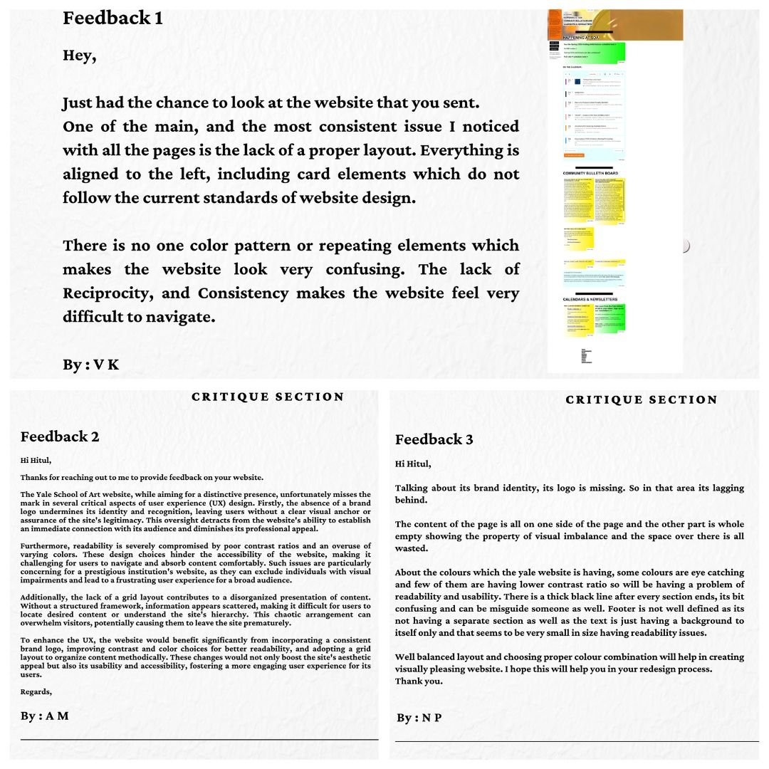
Key findings from user research and reviews
Design Process
The redesign focused on establishing a strong visual identity and improving usability:
1. Brand Identity
Created a custom wordmark logo and established a color system using Yale blue (#4169E1) and yellow (#FFFF00) as secondary colors against a primarily black and white palette.
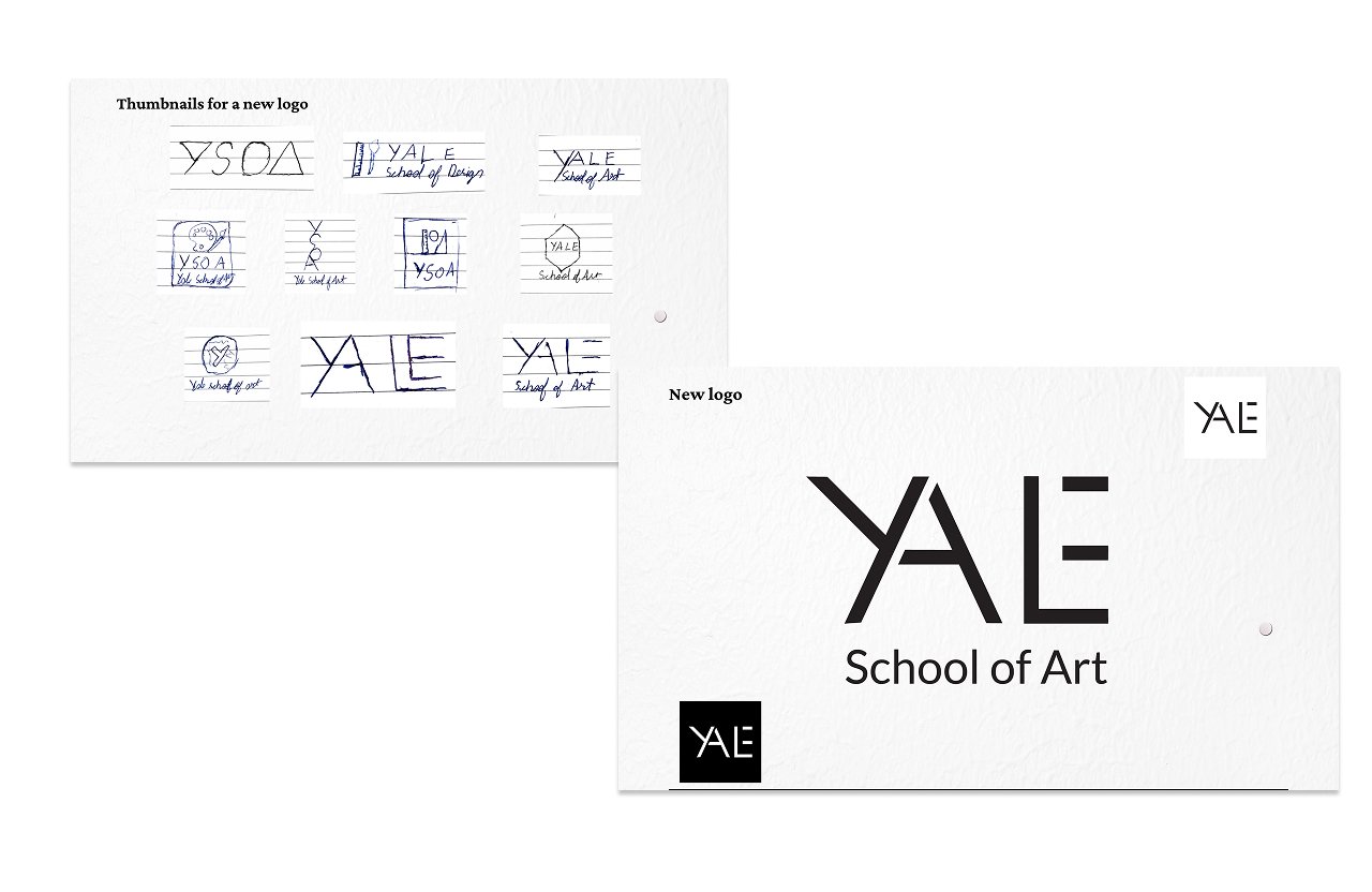
New logo and brand identity system
2. Grid Layout
Implemented a 12-column grid system to create visual balance and consistent spacing throughout the site.

Wireframes for desktop and mobile
3. Accessibility Improvements
Selected high-contrast color combinations and established a typographic hierarchy to improve readability.
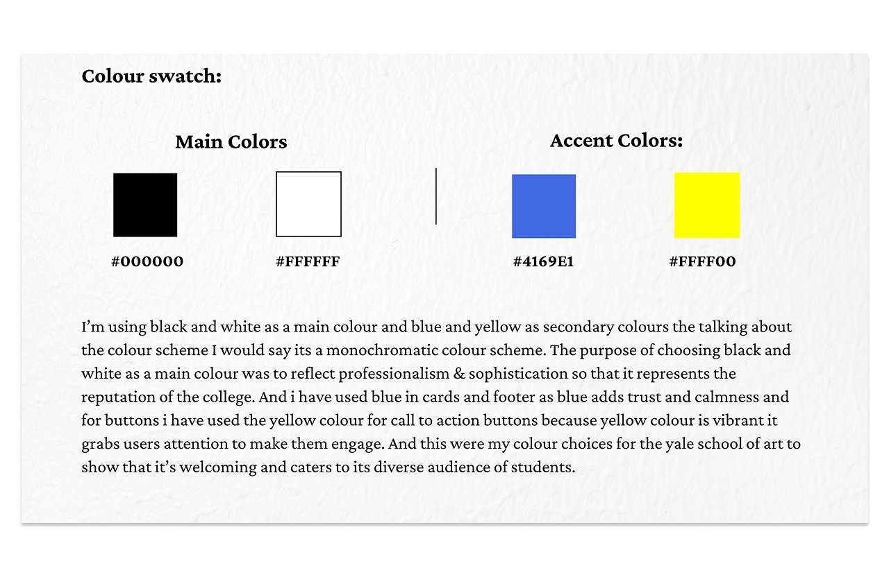
Color system
Final Design
The redesigned homepage features a clean layout with clear visual hierarchy and improved navigation:
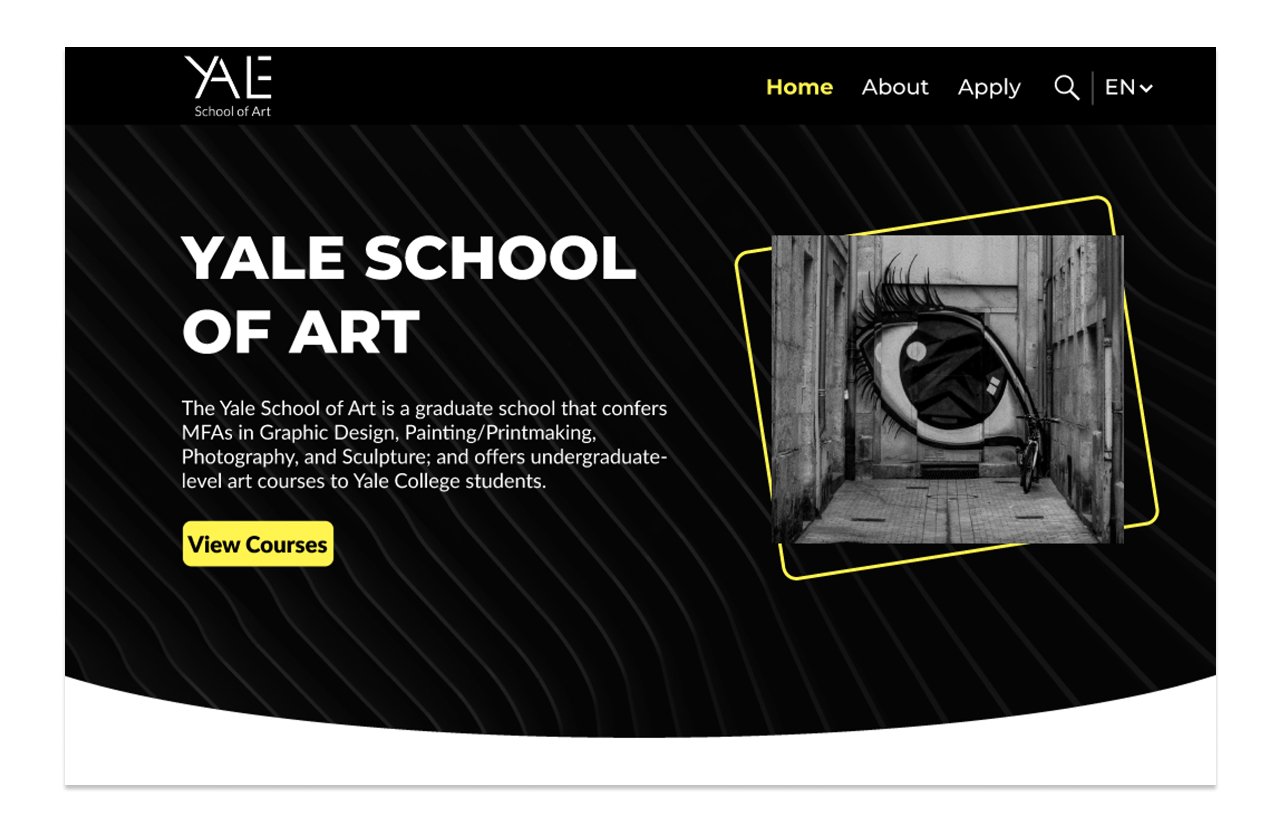
Redesigned Yale School of Art homepage
Key features include:
- Prominent logo and consistent branding
- Balanced grid layout with proper alignment
- Responsive navigation with visual feedback
- Accessible color scheme and typography
- Multilingual support for global accessibility
Results & Outcomes
The redesign successfully addressed the original issues while creating a more professional and accessible digital presence:
Strong Brand Identity
Established visual recognition with new logo and consistent branding
Improved Usability
Clear navigation and information architecture makes content easier to find
Enhanced Accessibility
WCAG-compliant color contrast and typography improves readability
Positive Feedback
Users reported better experience navigating the redesigned site
The project demonstrated how thoughtful UX/UI design can transform an institution's digital presence while respecting its heritage and mission.