Project Overview
As part of our User Experience Research II course at Algonquin College, our team conducted an informal heuristic evaluation of the SkipTheDishes mobile app. The project was designed to help us apply Jakob Nielsen's 10 Usability Heuristics in a real-world context by evaluating key user flows and identifying opportunities to improve the overall user experience.
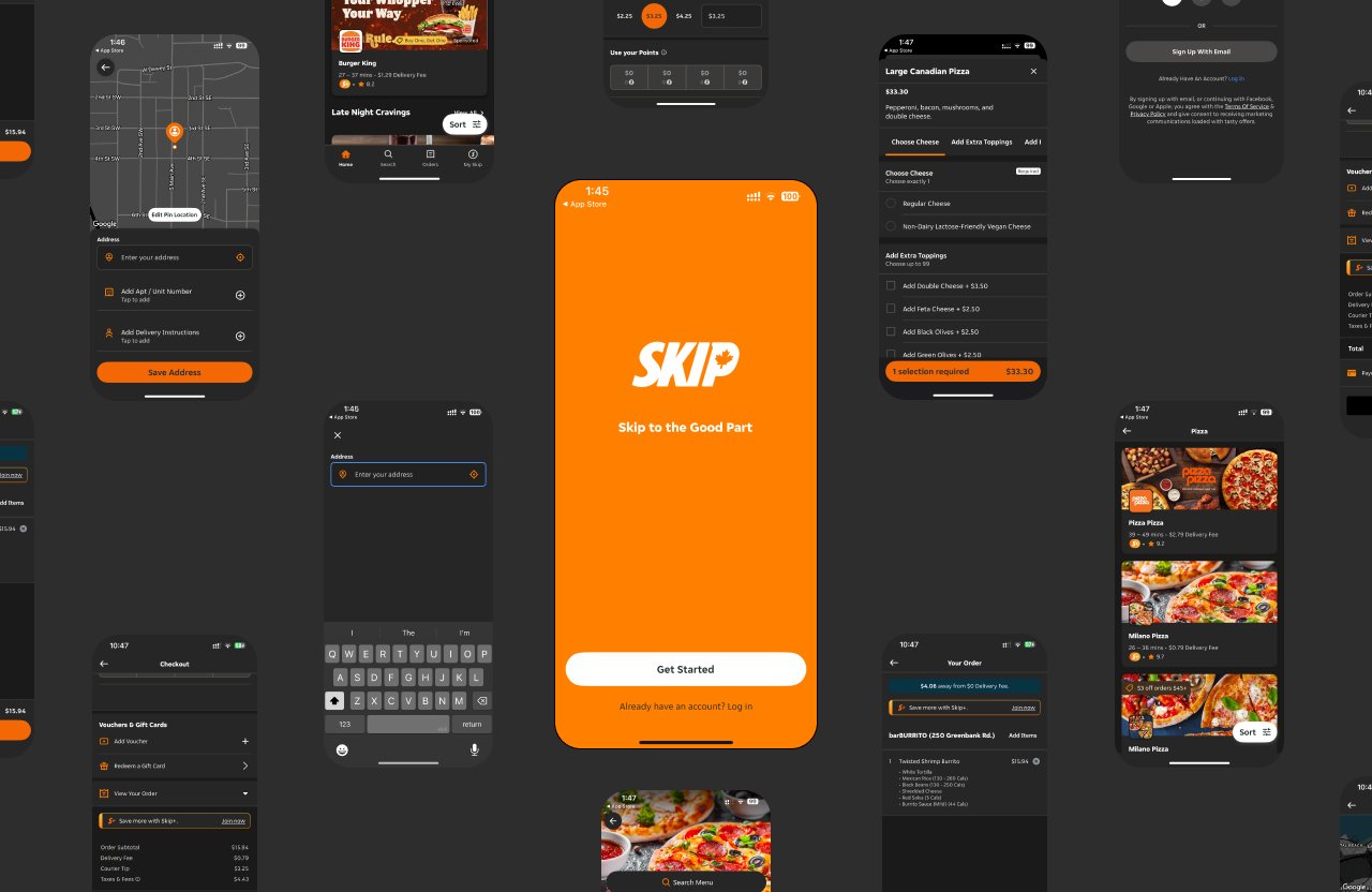
Some screens from the SkipTheDishes app that we evaluated
This was not a client-sponsored or official audit, but an academic and exploratory exercise meant to strengthen our ability to analyze usability challenges, synthesize insights collaboratively, and propose design solutions.
Evaluation Approach
We selected two common use cases that would allow us to examine the app's behavior in real decision-making and ordering scenarios:
Use Case 1: Filtering for Canadian Pizza
- App launch and login
- Granting location access
- Browsing and filtering pizza restaurants
- Reviewing restaurant page and menu
- Adding pizza to the cart
Use Case 2: Ordering a Burrito
- Searching for burrito restaurants
- Sorting by delivery time and offers
- Customizing the burrito
- Reviewing the order
- Proceeding to checkout
Heuristic Framework
Each screen and interaction was evaluated using Jakob Nielsen's 10 usability heuristics, covering:
1. Visibility of System Status
Keep users informed about what is going on through appropriate feedback within reasonable time.
2. Match Between System and Real World
Speak the users' language with familiar words, phrases and concepts.
3. User Control and Freedom
Users often perform actions by mistake and need clearly marked "emergency exits."
4. Consistency and Standards
Follow platform conventions and maintain consistency within the product.
5. Error Prevention
Either eliminate error-prone conditions or check for them and present confirmation options.
6. Recognition Rather Than Recall
Minimize the user's memory load by making objects, actions, and options visible.
7. Flexibility and Efficiency of Use
Accelerators may speed up interaction for expert users.
8. Aesthetic and Minimalist Design
Interfaces should not contain irrelevant information that could distract from primary content.
9. Help Users Recognize, Diagnose, Recover
Error messages should be expressed in plain language and suggest a solution.
10. Help and Documentation
Provide help documentation that is easy to search and focused on user tasks.
Key Findings
After synthesizing our individual evaluations, we observed a number of common themes across both use cases. The areas with the most recurring usability challenges were:
Weakest Performing Heuristics
Help and Documentation
Users lacked clarity on terms like "Sponsored," "BBOX," and interface elements without tooltips or explanations.
Flexibility and Efficiency
Many flows lacked shortcuts, saved preferences, or easy access to repeated actions like reordering.
Discoverability
Features like sorting or applying offers were hidden or unclear in the interface.
Consistency
UI behavior varied between screens (e.g., sort buttons, menu layout, checkout steps).
Detailed Findings Table
| Heuristic | Issue | Example | Severity |
|---|---|---|---|
| Help & Documentation | No explanation of "BBOX" or "Sponsored" labels | Search results show "BBOX" with no tooltip | 3/4 |
| Flexibility | No saved preferences for frequent orders | Must customize burrito from scratch each time | 3/4 |
| Consistency | Different sort button styles across screens | Home vs. restaurant list sort UI differs | 2/4 |
| Error Prevention | No confirmation before charging saved card | Checkout proceeds without final approval | 3/4 |
| Recognition | Ingredient options disappear when customizing | Must remember options when building burrito | 2/4 |
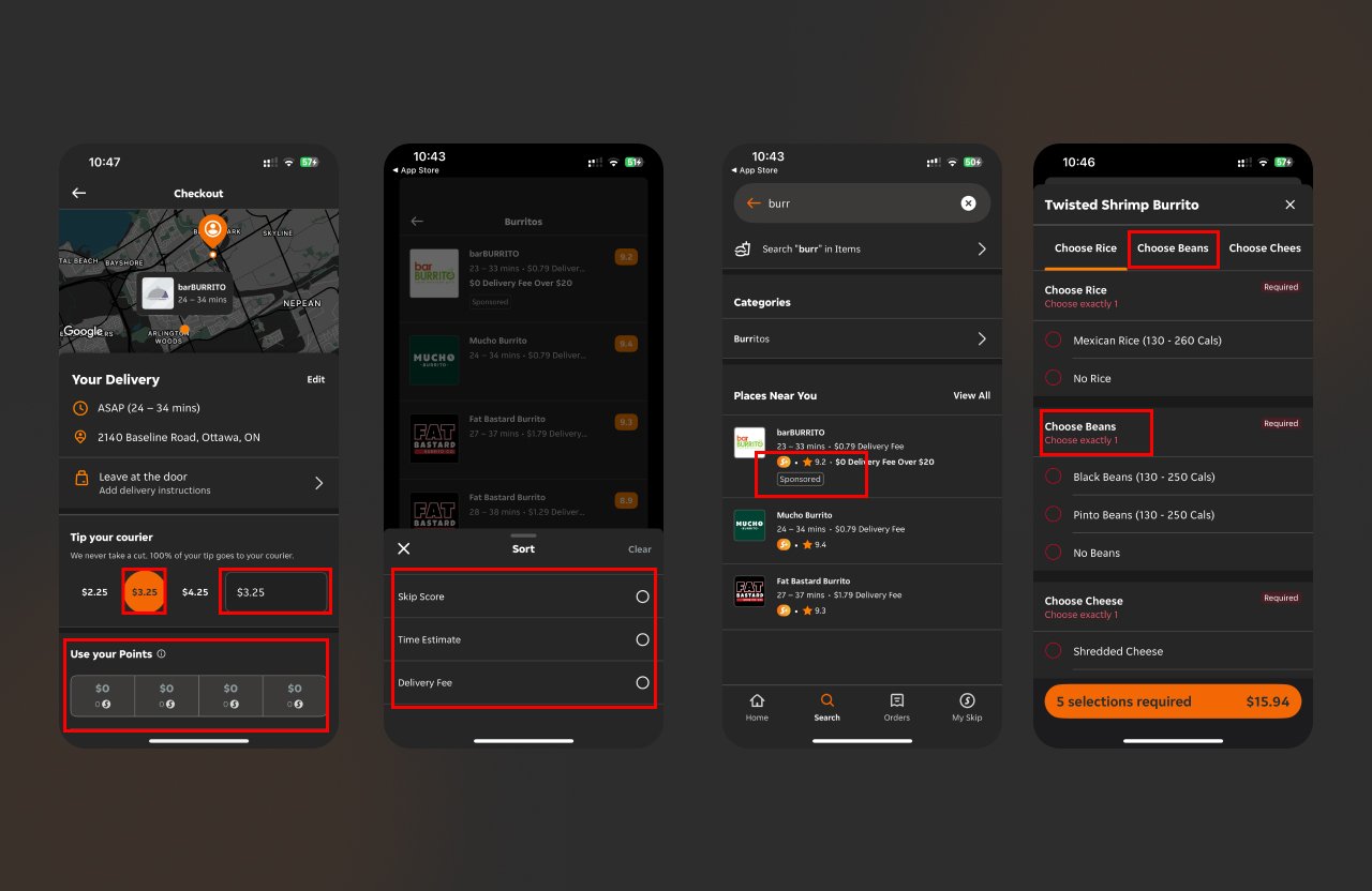
Examples of heuristic violations identified in our evaluation
Recommendations
Based on our group synthesis, we recommended the following improvements:
1. Add Contextual Help
- Provide quick info buttons for terms like "Sponsored," "BBOX," "Place Settings"
- Add onboarding hints for new users navigating search or offers
- Include ingredient descriptions in customization flow
2. Improve Sorting & Filtering
- Introduce filter combinations like "Under 30 min + BOGO"
- Make sorting options more visible and intuitive
- Add labels like "Fastest Delivery," "Top Rated," "Vegan"
3. Enhance Customization
- Allow users to "Save as Preset" for customized orders
- Add inline "Edit" options in the order summary screen
- Group ingredient options into clear tabs to reduce clutter
4. Streamline Checkout
- Add confirmation step before charging saved cards
- Improve clarity in tip selection and fee breakdowns
- Use real-time validation for addresses and payment
5. Standardize UI
- Collapse secondary categories into expandable sections
- Adopt consistent icon sizes, fonts, and placements
- Rework horizontal menus into vertical lists where appropriate
Team Process & Reflection
This evaluation emphasized the power of collaborative UX research. Each team member brought unique perspectives and spotted issues others missed. During our synthesis discussions, we:
Negotiated Differences
We discussed score interpretations and aligned on severity ratings through consensus.
Shared Perspectives
Different team members focused on different aspects (visual design, flow, microcopy).
Divided Responsibilities
We assigned sections based on individual strengths and interests.
Refined Together
All recommendations were workshopped to ensure they were practical and user-centered.
What I Learned
Conducting this heuristic evaluation allowed me to:
- Apply UX principles in a real-world app context
- Analyze detailed interface interactions from both user and design perspectives
- Collaborate effectively to turn observations into actionable insights
- Practice structured critique and constructive problem-solving
- Balance academic rigor with practical recommendations
The project reinforced that even without full-scale usability testing, a heuristic approach can reveal meaningful design flaws and opportunities for improvement.