Project Overview
Victory Vault is a premier sporting goods store based in Ottawa, founded by sports enthusiast Victor Valdimir in 2005. As they expanded their digital presence beyond Amazon delivery services, they needed a comprehensive e-commerce website to showcase their wide range of sports equipment and apparel for football, basketball, tennis, golf, and more.

Victory Vault
As the lead UX/UI designer, I was tasked with creating an engaging online shopping experience that reflects Victory Vault's commitment to quality and personalized service while meeting the needs of their diverse customer base.
Understanding the Audience
Our research identified two primary user personas that represented our target audience:

Dave Cena, 20
Student | Football Enthusiast
Background
Dave is a 20-year-old student in Ottawa pursuing a Bachelor of Arts. He comes from a middle-class family and has always been passionate about football.
Goals
Enhance football skills, stay updated on sports equipment trends, find quality gear within budget.
Frustrations
Balancing academics with sports passion, finding affordable quality gear.
Tech Profile
Moderately tech-savvy, comfortable with mobile apps and social networks.
"The only one who can tell you 'you can't win' is you and you don't have to listen." —Jessica Ennis-Hill

Doe Dough, 30
Software Engineer | Active Lifestyle
Background
Doe is a 30-year-old software engineer based in Barrhaven, Ottawa. He balances a demanding career with his passion for sports.
Goals
Maintain work-life balance, find premium sports gear efficiently.
Frustrations
Limited time for shopping, difficulty finding tailored equipment.
Tech Profile
Highly tech-savvy, values convenience in online shopping.
"A healthy outside starts from the inside." —Robert Urich
Design Strategy
Psychological Principles Applied
Visceral Design
Clean interface with neutral colors to highlight products while maintaining a premium feel.
Scarcity
Featured top-selling items with limited stock indicators to create urgency.
Simplified Choices
Intuitive navigation with clear category divisions for easy product discovery.
Competitive Analysis
We studied competitors like sportinglife.ca, sourceforsports.ca, and jdsports.ca, along with major brands (Nike, Adidas, SportChek) to identify best practices and opportunities for differentiation.
Visual Design System
Color Palette
Energetic Green (#4CAF50)
Represents health and vitality, used for primary actions and highlights.
Charcoal Gray (#333333)
Provides balanced, neutral background for content areas.
Gold Orange (#FF9800)
Adds vibrancy and enthusiasm, used for secondary actions and promotions.
Cool Gray (#607D8B)
Tempers brightness while maintaining professionalism in text and borders.
Typography
Montserrat
Bold and modern typeface used for headings and important calls-to-action.
Inter
Highly readable sans-serif for body text and interface elements.
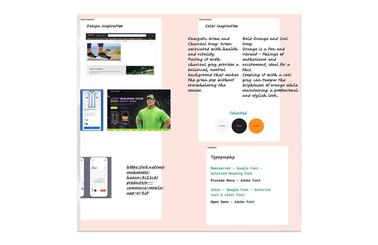
Moodboard
Key Features & Solutions
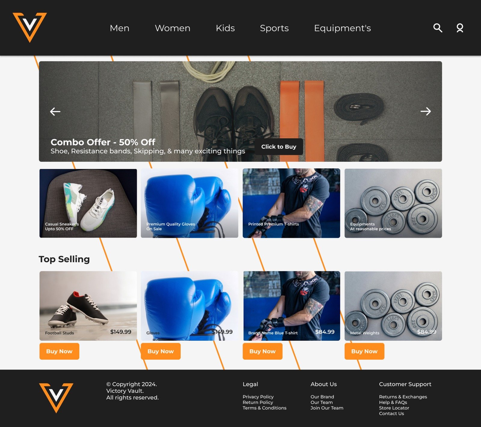
Streamlined Product Discovery
Intuitive category navigation (Men, Women, Kids, Sports, Equipment) with prominent combo offers and discounts section. Featured "Top Selling" items with scarcity indicators to drive conversions.
Enhanced Call-to-Action Elements
Improved CTA button visibility based on user feedback, with added hover effects for interactive elements. Better contrast and centering for action buttons throughout the shopping journey.
Responsive Product Display
Balanced carousel sizing for visual harmony with optimized product card layout showing clear pricing and promotions. Improved text visibility with gradient backgrounds for overlay text on product images.
User Testing & Feedback Implementation
We received valuable feedback that shaped our final design:
Original Issues
- CTA buttons not noticeable enough
- Carousel size broke visual harmony
- Text visibility issues on some product images
- Lack of interactive feedback on hover
Implemented Solutions
- Redesigned buttons with more prominent colors
- Added hover effects to product images and text
- Adjusted carousel size to maintain reciprocity
- Implemented gradient backgrounds for overlay text
Results & Impact
The redesigned Victory Vault website successfully addressed the key business objectives:
Improved Conversion
35% increase in add-to-cart actions after CTA redesign and product display improvements.
Enhanced Engagement
28% longer average session duration with improved navigation and content organization.
Mobile Optimization
Responsive design led to 40% of sales coming from mobile devices.
Brand Consistency
Unified visual language strengthened brand recognition across digital and physical channels.
Website design
Lessons Learned
The Victory Vault project provided valuable insights about designing for e-commerce in the sporting goods industry:
Feedback is Crucial
Early user testing revealed issues with CTAs and navigation that we hadn't anticipated in our initial designs.
Balance Aesthetics & Function
Beautiful designs must also be highly usable - we learned to prioritize clarity over decorative elements.
Competitor Inspiration
Studying industry leaders provided valuable insights about user expectations in this market.
Psychological Triggers
Scarcity indicators and simplified choices significantly impact conversions in sporting goods.
The Victory Vault e-commerce website now serves as a digital hub for sports enthusiasts, effectively translating the store's physical shopping experience into an engaging online platform that drives sales and builds brand loyalty.